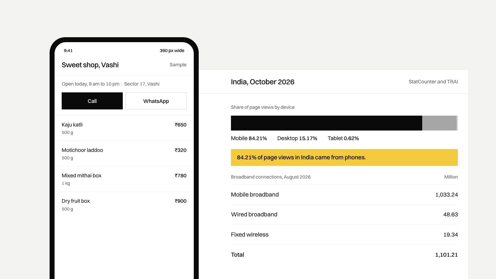
In India the phone is the main way people reach a website. StatCounter measured 84.21% of web page views in India on mobile in October 2026, against 15.17% on desktop. TRAI counted 1,033.24 million mobile broadband connections at the end of August 2026, out of 1,101.21 million in total. Google ranks sites on their mobile version. So we design the phone screen first and the desktop screen after it.
How many people in India browse on a phone?
The two sources measure different things.
| Figure | Source and date | What it measures |
|---|---|---|
| 84.21% mobile, 15.17% desktop, 0.62% tablet | StatCounter, October 2026 | Share of page views on the websites that run StatCounter tracking. It counts visits, not people. |
| 1,033.24 million mobile broadband connections | TRAI press release 125/2026, end of August 2026 | Mobile wireless broadband subscriptions, including dongles and machine connections. One person can hold two SIMs. |
| 48.63 million wired broadband connections | Same release | Fibre, DSL, cable and other fixed wired lines. |
| 19.34 million fixed wireless connections | Same release | 5G home broadband (FWA), Wi-Fi and similar. |
| 1,101.21 million broadband connections in total | Same release | All three of the rows above. |
Neither figure is about your customers in particular. A B2B supplier whose buyers sit at office desks may see more desktop traffic than the national share. Your own Google Analytics or Search Console will show your split, and that's the one to design for. For a shop, clinic or restaurant in Navi Mumbai, expect it to look closer to the national figure.
Does Google judge my site by its phone version?
Yes. Google's own documentation says it "uses the mobile version of a site's content, crawled with the smartphone agent, for indexing and ranking." If a section, a price list or a block of text appears on your desktop page but is hidden or cut from the phone layout, Google may never see it. Keep the same content on both, even if the phone version arranges it differently.
Google also measures how fast and stable your pages feel to real visitors, with phones and desktops scored separately. Our SEO checklist for launch covers those Core Web Vitals and their thresholds.
What does mobile-first change in practice?
Mobile-first means the phone layout gets designed and approved before the desktop one. It changes the decisions below.
What goes on the first screen
A phone shows a small slice of the page before anyone scrolls. On desktop you can fit a headline, three services and a form side by side. On a phone you choose one message and one action, usually "Call" or "WhatsApp us". Making that choice first keeps the desktop page focused too.
Where the buttons sit
People hold the phone in one hand and tap with a thumb, so the main actions belong low on the screen and within reach. For a local business we like a call and WhatsApp bar fixed to the bottom of the screen on phones. A desktop-first design usually puts them in the top corner, the hardest place for a thumb to reach.
How heavy the pages are
A banner image that looks fine on office broadband can stall on a weak 4G signal inside a building. Designing for the phone first means sizing each image for the phone screen and serving the larger version only to larger screens.
Menus and tables
A seven-item menu bar has to collapse on a phone, so decide which two or three pages matter most. A price table with six columns won't fit at phone width either. Turn it into a list, or let the table scroll sideways inside its own box.
Large text settings and Indian scripts
Some people raise the font size in their phone settings, often older customers. A layout that only works at the default size will overflow or clip words. Hindi and Marathi in Devanagari need more line height than English, and a translated label is often longer than the English one, so leave room in buttons and menus from the start.
Forms
Typing on a phone is slow. Ask for less, use the number pad for phone numbers, and make sure the keyboard doesn't cover the submit button. Our website fix checklist lists the form fixes in detail.
How do you test a site on a phone?
The browser's phone preview on a laptop is a start, but it runs on a fast laptop over office internet. Open the site on an actual mid-range Android phone, on mobile data, and try to do the one thing a customer comes to do. Every page on our own site is checked at 390 pixels wide, a common phone width, and at tablet and desktop widths before it ships.
Free tools help with the numbers. PageSpeed Insights reports the phone and desktop versions of a page separately. Search Console shows how Google sees your pages once the site has some traffic.
Our take
For a small business in Navi Mumbai, Ravi would approve the phone design before anyone opens the desktop design. If a client can only review one, it should be the phone version, on their own phone. A desktop layout that is a stretched copy of a good phone layout is acceptable. The reverse, a desktop page squeezed onto a phone, is what loses calls.
If your current site was designed for desktop and only "made responsive" later, you don't always need to start again. Fix the first screen, the buttons and the image sizes, then decide. If you're weighing a rebuild, our website development cost guide sets out what each tier costs, and our web development page covers how we build.
Where these numbers come from
We checked every source on 3 November 2026.
- India page views by device, October 2026: StatCounter, desktop vs mobile vs tablet market share in India.
- Broadband connections by segment at the end of August 2026: TRAI press release 125/2026, dated 28 September 2026.
- Google indexing and ranking on the mobile version: Google Search Central, mobile-first indexing best practices.